Marc van Bree posted a superb article on 7/18/2012 over at Dutch Perspective titled Why performing arts organizations are not app-ropriate that is one of the best resources I’ve come across in recent months which arts organizations can take advantage of when determining whether or not their organization should consider developing an app. He starts off by referencing some recent and reliable mobile user statistics then moves into how and why all of this matters to arts orgs.

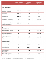
Van Bree identifies three options arts orgs can use for their mobile platform solutions: native mobile apps, mobile websites, and responsive design websites. For visually oriented readers, he’s prepared a handy chart which overviews pros and cons for each of the three solutions from the key perspectives of user experience, backend management, and development.
The only variance I have with his chart rating is when it comes to the categories of load speed and design for mobile users’ needs and usability. Van Bree gave the responsive design option receives one out of three stars and I could get on board with that but only under the following conditions.
The handful of groups experimenting with the newest option of the bunch, responsive design platforms, tend to copy layout and information architecture practices drawn from traditional desktop design and hope the responsive engine sorts it all out so that it works properly on mobile devices. Specifically, they overload responsive engines by applying liberal use of images for graphic design elements instead of relying on CSS3, carrying over multiple child and grandchild menu items instead of combining content via CSS driven tab and toggle tools, and maintaining redundant or outright unnecessary content.
Perhaps unsurprisingly, this approach doesn’t always turn out all that great but for those groups who are rethinking the basic nature of web design from the responsive perspective, they’re discovering that load speeds are just as fast if not better than a separate mobile optimized site and usability skyrockets when you incorporate more click and swipe based finger gestures for navigation elements.
So yes, I’d agree with van Bree that responsive design platforms should receive one star out of three for the first two User Experience categories, but only for groups that are approaching their responsive design in similar fashion to installing a carburetor in a next-gen hybrid. Sure, you might be able to do it, but you probably won’t like the results.
For groups which successfully adapt to the new design standards, those ratings would go up to two or three stars out of three.
Short On Time?
Then set aside van Bree’s article for later and stop by Proper Discord’s recent post on apps which has far less words and a nifty flow chart. Plus, it’s funny and that never hurts.
Additional Resources
[ilink url=”http://mobile.smashingmagazine.com/tag/responsive-design/”]Embrace your inner geek with Smashing Magazine’s Responsive Design article index.[/ilink]
[ilink url=”http://uxdesign.smashingmagazine.com/2012/05/30/design-process-responsive-age/”]Get a better grip on how to go about a better design process in the responsive age.[/ilink]
[ilink url=”https://adaptistration.com/blog/2012/02/27/what-the-orchestra-field-can-learn-from-playboy-and-the-financial-times/”]Commentary on the “why apps?” debate.[/ilink]
[ilink url=”https://adaptistration.com/blog/2012/04/24/another-voice-questioning-the-need-for-apps/”]More commentary on the “do we really need an app?” discussion.[/ilink]
The ratings were sometimes be a little tricky. Just like your point about the load speed and usability. They’re not supposed to be interpreted in a “three stars is good” and “one star is bad” fashion, but rather one option relative to the other in a very general sense and not saying anything about the distance between the stars. For example, I could also certainly make a case that responsive design is more expensive and time consuming to develop than a native mobile app.
The how (as in how you implement) is in these particular cases more important than the what (as in app, mobile site, or responsive design).
I think you’ve hit the nail on the head with what is one of the most difficult aspects for groups to wrestle with when engaging tech discussions; specifically, the “how” end of things. These conversations are plagued by immensely detailed topics, some of which are defined more by perspective than anything else.
On one hand, developing a site based on a responsive design could be less time consuming than not; especially if the group had planned to engage a major redesign to begin with (complete overhaul of design *and* new copy, content, etc.). But that’s only if the people doing the work are versed in the platform and the project management knows how to guide the copy writing, nav architecture, etc. and work with the client in a way it maximizes the benefits of responsive design.
At the same time, and from the perspective of a tech provider, I know that not every client is in the right place to jump into that process and get everything they can out of it. Consequently, finding an alternative solution that makes those changes easier than not down the road while keeping them educated on ever-changing options and how best to grow toward improved platforms is in their best interests.
But that’s not what most arts groups likely hear when they talk to vendors, the latter of which may be more interested in promoting solutions which benefit them more than the client.
The best solution I can see is to keep talking about everything, which in turn will increase awareness and accelerate a much more comprehensive understanding of what’s out there so groups can make good decisions. So kudos for your article as it moves people in that very positive direction!