The Annual Orchestra Website Review examines more than 80 professional orchestras in the United States and Canada and rank them by a detailed series of quantitative criteria but due to Orchestra Crisis 2012/13 (details here) we had to postpone and scale back the reviews. As it turns out, the delay was fortuitous in that it set the stage for ideal timing to focus the review efforts exclusively on what is easily one of the most important design standards for performing arts organization website to date: responsive design.
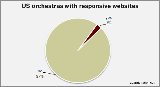
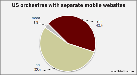
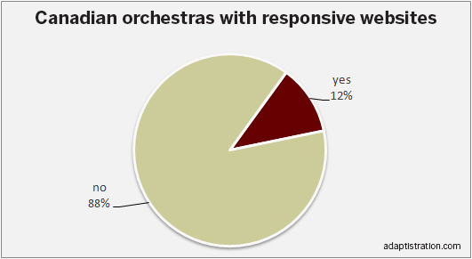
 Specifically, we’re going to see which orchestras have adopted responsive design standards, which ones maintain mutually exclusive desktop and mobile website solutions, and which ones are stuck in a pre-economic downturn mindset.
We examined what responsive standards are and why they are so important to contemporary designs in an article from 4/30/2013 so if you’re starting from scratch on this topic, that’s a good source to review before jumping into the review data.
Criteria
The mini-review criteria are very straightforward and entirely close-ended in that sites were evaluated on whether they are responsive and if not, do they offer a mutually exclusive mobile version. Responsive sites are more desirable and of those which were not responsive but had a mobile version, the mini-review did not include additional assessment of the design or user experience for those offerings.
[css3_grid id=’US_Orchestras’]
[ilink url=”https://adaptistration.com/hi-lets-talk” style=”note”]Don’t think your orchestra is evaluated correctly? Tell us about it.[/ilink]
[/tab] [tab title=”Canadian Orchestras”]
[css3_grid id=’Canadian_Orchestras’]
[ilink url=”https://adaptistration.com/hi-lets-talk” style=”note”]Don’t think your orchestra is evaluated correctly? Tell us about it.[/ilink]
[/tab] [tab title=”Quick Facts”]
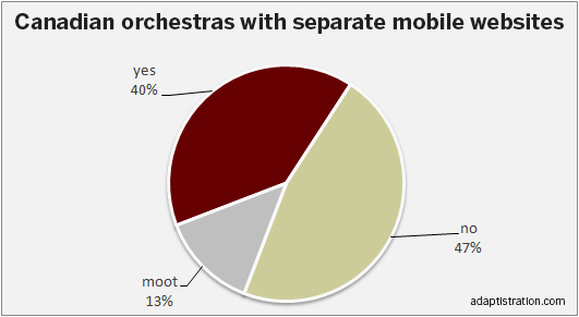
[/tab] [tab title=”Oh So Cool”]
Seeing that the mini-review is all about the value of responsive design, it made since to present the findings in a chart that is 100 percent responsive as opposed to an old school HTML table.
For example, if you’re viewing the results on a desktop, laptop, or standard size tablet the table will be displayed in three columns whereas if you’re on a Smartphone or mini-tablet in portrait orientation, the display has automatically reconfigured the data to display in two columns that beg the user to effortlessly scroll.
The really cool part is the responsive engine pulls the data from the very same source, no need to create a separate version for each device; the responsive engine does all the heavy lifting for you. Enter the data once and you’re done!

[/tab]
Looking Ahead: Tapping Into Commonsense
Although there are no rankings in the mini-review, it is still clear that the vast majority of orchestra websites are falling behind when it comes to keeping up with contemporary design and development standards.
Responsive design is not only here to stay, it is what competitive performing arts organizations need in order to take the next step in improving marketing performance and staying relevant to their patrons.
In the end, maintaining mutually exclusive solutions for desktop and mobile device websites is a drain on time, resources, and patience.
But the silver lining here is adopting a responsive design is much easier than most groups might realize so don’t let a lack of knowledge keep your organization away from adopting a responsive design. Likewise, even if you currently maintain a separate mobile web solution, wrapping everything up in a single responsive design is a comparatively simple undertaking.
Overall, it is an uncomplicated process and can even be as simple and as quick as porting over all of your existing content and design elements into the new framework thereby leaving you free to engage a more thorough redesign process at a time that’s better suited.
Simply put, responsive design is commonsense.
Wow! Many of these ensembles–Philly, BSO, San Fran, NYPhil, etc. (and, ignoring this site’s primary focus, BAM and Carnegie Hall)–have recently (within the past three years, say) overhauled their websites completely. I wonder if having a responsive website seems, at least until the existing site is definitively obsolete, like a frivolous expense. Or are these orgs experiencing buyer’s remorse?
That’s a good question but in most cases, converting the existing site to a responsive framework shouldn’t be a costly endeavor for all but the most complex sites (especially those which integrate the entire shopping cart and payment portal experience into the related website). In general, breaking out of the notion that changes are only capable during design cycles is perhaps the largest fundamental shift in perception that arts groups will need to embrace.
Hi Drew: Unfortunately, responsive conversion can be costly WHEN the site design needs to be recreated. The design process is often free form and orchestras can create a very long approval process — with those costs coming back to the orchestra. At least, that’s been our experience.
It sounds like we have vastly different internal processes when it comes to converting sites Ed; for us, it is actually very quick and certainly no more costly than a new design. I’m not sure what you’re referencing with regard to a free form design process and I think we may be talking about different things, specifically, I’m confused by your reference to approval processes and related costs.