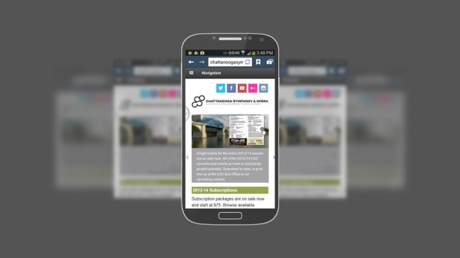
As the 2013/14 season is getting underway for most groups, this is an ideal time to make sure you aren’t inadvertently overlooking a few vital aspects at your website that are should be easy to modify. To that end, let’s take a look at what those are and how they can be corrected.
1) Subscription sales are up but no notice about when singles go on sale.
It’s no secret that you should be eyeball deep in your subscription sales push but in addition to those links you should also have notices about when single tickets go on sale. In the end, you don’t want to cannibalize your subscription sales but posting a simple notice along the lines of “Single tickets go on sale [day], [mm/dd/2013]” notice will do just fine.
Tip: be sure to include the single ticket date notice on individual event pages as well as any ticket or box office overview page(s).

2) Dead end action items.
One of the areas where orchestra websites have improved the most over the past few years is adopting some sort of homepage slider; and although it sometimes goes by different names, it is the large image based promotional item that rotates any number of images.
These are terrific tools for fitting a large amount of content in a comparably small footprint but one bear trap to avoid is forgetting to include a link to the conversion target. For example, if one of your slides promotes subscription sales, there should be a link to the internal page selling the subscription packages.
One item to consider here is if the entire slide is the clickable link, don’t forget to include some sort of visual notice to that effect, including a redundant action button or iconography confirming a clickable action exists is the way to go.

3) No day-of event info listed.
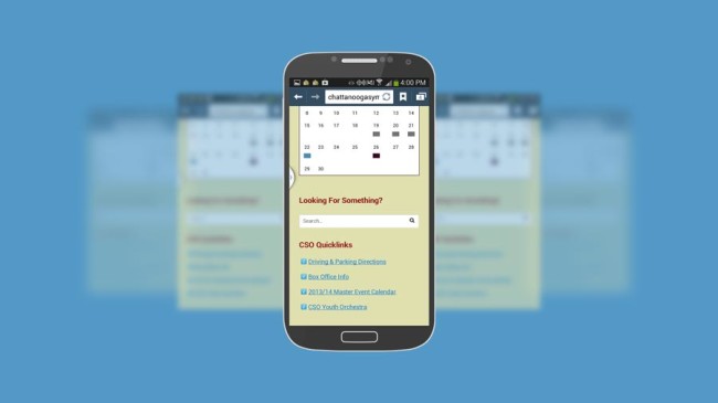
Ideally, your homepage has some sort of direct link to basic event day information such as parking, directions, traffic, box office info, weather, etc. In short, anything your patrons might be looking for the day of an event should be no more than a single click away.
These items lend themselves to something as simple as list style group of links or if you’re brave enough to trust the technological literacy of your audience base (and you should be), descriptive icons are a great way to go as well.

Conclusions
In the end, thinking about the sorts of small changes that can improve your site bit by bit is a good habit to develop. Assuming your website provider offers the sort of access and control you should have over your website’s content and functionality, each one of these items should only take minutes to update.
Having them in place makes your site more likely to produce an overall positive user experience while simultaneously maximizing revenues and engagement.