Responsive design has been a boon for arts organizations and what was once a nearly unknown term three years ago is increasingly common; so common in fact, that the development field is beginning to distort what responsive design is all about. Case in point, one of Venture’s users, Rachel Carneglia at Morikami Museum and Japanese Gardens Online Marketing Coordinator, recently pointed out an article at venturebeat.com (no affiliation to The Venture Platform) titled “Is responsive design killing mobile?”
It’s a good article except for the fatal flaw of categorizing what responsive design is really all about then portraying it as a jack of all trades but master of none solution.
“The content served up to the user is the same as on a desktop site, and while they layout is organized to accommodate a smaller screen, it is important to remember that the integrity of the desktop site is intended to remain as true to form as possible and any changes to the desktop site will also affect the mobile site”
Simply put, that is categorically incorrect. The notion that a responsive site must deliver all content from each page on all browser widths is the opposite of what good responsive design is all about.
Having said that, it’s still all too easy for developers to sit back and overlook the entirely useful content pruning process that helps users determine which content to include across every display threshold; i.e. the max browser width on the typical smartphone, tablet, laptop, and desktop displays. Most folks are familiar with this concept via the name mobile first design, which purports building out your content architecture starting with mobile thresholds and working out from there as opposed to the more common method of starting big and going small.
As a result, it’s no surprise to see an opinion like the one from the article assert the misnomer that responsive design is all about serving up identical content.
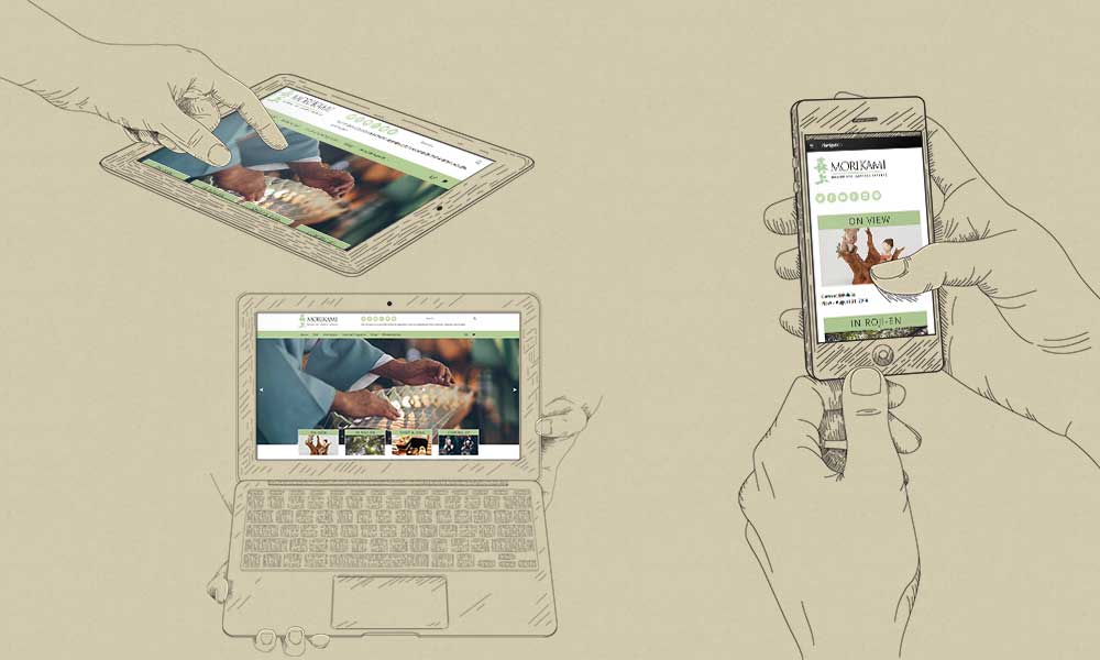
But it’s high time to update the “mobile first” so to that end, let’s start calling it “thinking responsively” and since Rachel at Morikami was good enough to tip us off to the venturebeat.com article and their site is currently in development, they are perfect candidates to use for this public examination. To that end, I’m grateful for their willingness to let us use an in-development version of their site for everyone’s benefit.
Thinking Responsively About The Morikami Homepage
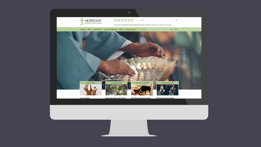
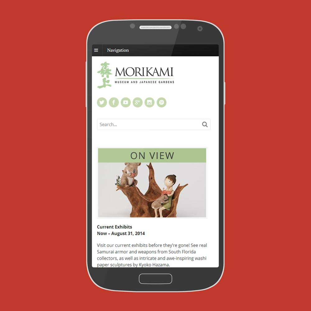
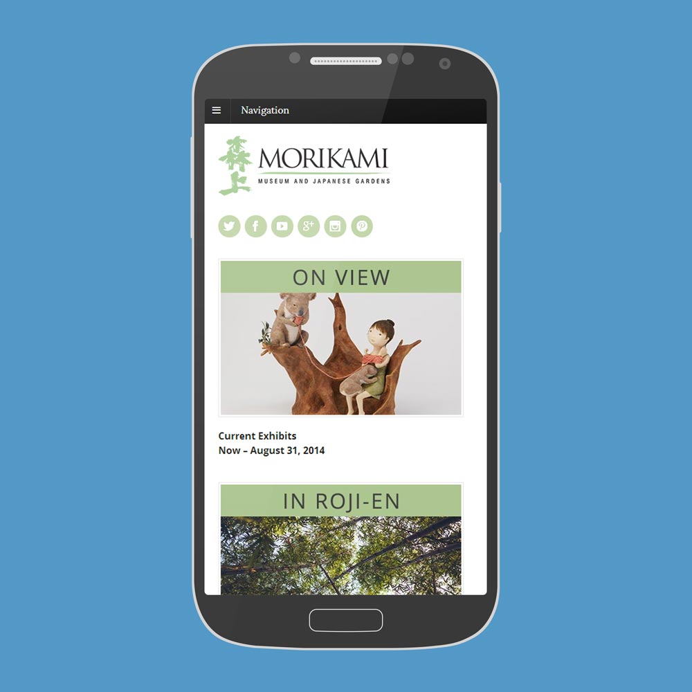
One of the best candidates to use for this process is some sort of popular landing page; to that end, the homepage is a good target. Most homepages are fairly straightforward these days: some sliders or a hero area, some modular content, some text and ta-da, you have a slick looking homepage! But what if you’re not using sliders to actually convey necessary info and instead rely on them more for visual impact. Do users really need that on your mobile device view (i.e. smartphone and tablets)?
What about pruning down the homepage elements to a point where you get far less content but maintain 100 percent of critical conversion elements?
Let’s take a look at the ongoing Morikami project’s homepage as an example:
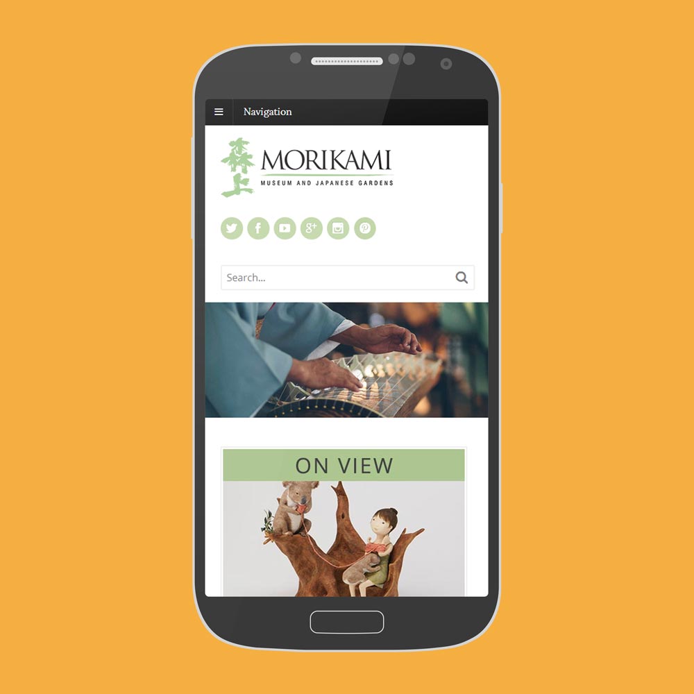
Using the blue background image as a guide, we’re now in a position to think about how those images and related bits of copy should be designed. Think of this step as something akin to designing a television commercial; to that end, talk to enough producers and you’ll encounter many who advocate watching an advertisement with sound off in order to see if it still manages to convey the core message. If so, mission accomplished and when you apply that concept at this stage, it is a good way to make sure your homepage images and headers are contributing to positive user experience (UX) by conveying the message you need to deliver.
Consequently, if the images and remaining copy don’t convey a clear enough message, then it probably won’t take you very long to make the needed adjustments; which, in turn, carry over to the tablet and desktop versions so hooray for universally improved UX.
In Morikami’s case, they are going to think about refining the images and header content plus consider inserting a copy of the search field into their hamburger menu (adorable name, no?) so that it isn’t entirely absent from the mobile experience.
We’ll expand on this in Part 2 by providing step by step instructions on how you can apply our “thinking responsively” approach to your organization’s website.

5 thoughts on “Thinking Responsively Part 1”