Picking up where we left off in Part 1, we’re going to walk through the steps you can use to begin “thinking responsively” about your organization’s website. To that end, let’s start off on the right foot and acknowledge that the vast majority of performing arts based websites are designed using the old school static Photoshop mockup cycle of design, focused almost entirely on desktop layouts. Should you do it this way? Absolutely not, but that’s okay and the good news here is there’s plenty of opportunity to get your site moving in a better direction until you can start your next project using a better method.
Thinking Responsively About Your Website
Odds are, your website isn’t functioning on a responsive platform to begin with and if that’s the case, then this post is going to be mostly academic and the key take-away item is making sure your future redevelopment project uses a provider that knows how to make this process part of the project from square one.
Before we jump into the details, let’s need to cover a few crucial frame of reference items.
- We’re assuming that you’re website is built atop a responsive publishing platform.
- Just because a website has responsive functionality doesn’t mean it was designed to make it easy to implement a thinking responsively strategy.
Responsive design has evolved to the point where lazy developers are taking advantage of users by packaging solutions that do rearrange content via prescribed browser widths, however, they do it in the most ham-handed fashion by making it unnecessarily difficult (or at the very least, quite costly) to implement content filters via CSS. What this means is it makes what should be a simple modification to implement exponentially more difficult.
Let’s examine this more by jumping into the step by step process you can use to begin identifying content to filter across display thresholds.
What are display thresholds?
Although standards constantly evolve, typical breakpoints at the time this article was written are 350, 768, 980, and 1280 pixels wide.

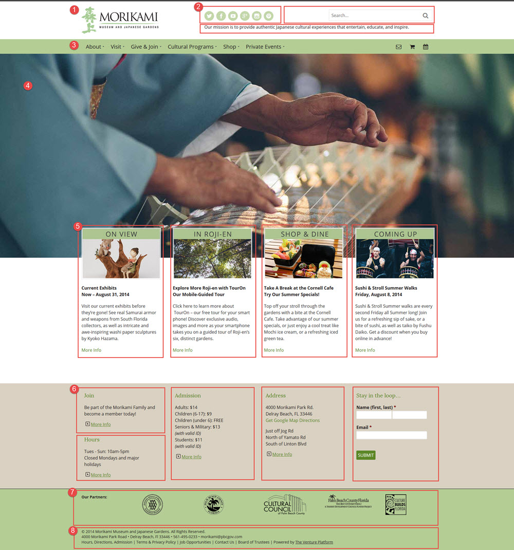
Here’s a case in point for what’s being described (once again, my thanks to Venture Platform user Morikami Museum and Japanese Gardens for once again letting us use their site, which is currently in development, as an example).
There are eight primary areas of content displayed on the full desktop view (980 pixels and wider) to consider displaying across narrower thresholds:
Some of these items will be addressed automatically, such as the primary navigation, which collapses into a hamburger navigation toggle. Everything else is up for grabs.
Here’s where the quality of your responsive platform will make or break your ability to make this a simple CSS driven modification that will only take seconds to set in place or an expensive bit of custom programming that will take days or weeks to implement.
After completing an internal content review, Morikami decided they only needed the following items to show on Smartphone layouts:
- Logo
- Header elements (social icons, search, and text based mission statement)
- Primary navigation
- Homepage slider image
- Four columns of free form content (images, headers, text, and hyperlinks)
- Footer content, widgetized
- Footer content, static
- Footer content, static
You notice that only some of the items in sections with multiple areas of content were cut. A smart responsive platform design will include unique CSS classes for as many items as possible; for instance, a less robust platform would only provide a single CSS class for every item within #2 or #5. In that case, it’s all or nothing but a better solution will go to the effort to generate those unique classes, making it a piece of cake to filter specific items across display thresholds.
For example, the items in #5 have three distinct classes, one for the image, one for the header items, and one for the text area; the latter of which has been defined as “p.specialBlurb” so all that’s needed to hide it is to add a “display:none” declaration to the .specialBlurb selector, here’s a screencast video illustrating what all of this geekspeak means in a practical sense: http://screencast.com/t/aKj9Rs78U
With that fundamental groundwork in place, all that’s needed to implement the filter(s) is to simply tell the platform whether or not it should display that element across specific thresholds; here it is in code…
@media only screen and (max-width: 768px) {
 p.specialBlurb {
 display: none;
 }
 }
…it is telling the system to filter out those elements on any browser up to 768 pixels wide, regardless of the type of device used. In English, this means the text and hyperlink won’t show up on Smartphone and most tablet portrait aspect ratios. Here’s how those columns of free form content from #5 would look like to a site visitor visiting on a device with a browser smaller than 768 pixels wide: http://screencast.com/t/MHZ8zv19c
Thinking Responsively On Your Own
Don’t let all of the geek-speak above scare you away, the actual process is very straightforward and your web provider will worry about the technobabble for you.
- Start with something straightforward like your homepage (don’t be afraid to physically print out the entire page and go to town on it with a sharpie).
- Identify elements and take a shot at classifying primary and secondary items (like items #2 and #5 from the Morikami example).
- Conduct some content triage: do I need this (yes/no); if yes, can any part of it be removed; if no, could I come up with some revised version that will let me filter out part of the content, etc.
- Review the results to your web provider and see if it is possible implement some simple display filters.
That’s it.
In the end, you can apply the same process to pretty much any page at your website but don’t forget, if you’re not already using a responsive platform, you’re likely out of luck so save yourself some time and verify that bit before you begin. On the bright side, you now have one more must-have item for your redesign list!
Questions?
Don’t be shy about getting in touch via comment or email with questions. There’s a good bit here to cover, especially if technical specs aren’t something you deal with every day. What’s important is to make sure you’re maximizing your website’s impact so to that end, let’s help build confidence and understanding.

1 thought on “Thinking Responsively Part 2”