Since it was originally published in 2012, the free Website Branding Style Guide resource here at Adaptistration has been a steady fixture among the most popular content. No worries, that resource isn’t going anywhere in the near future but it is worth pointing out that a similar service from a relatively new provider, Frontify.com, is available and offers considerably more than Adaptistration’s comparatively straightforward version.
One of Frontify’s team members, Josip Budzaki, authored a 2/9/2016 article at SmashingMagazine.com that uses a case example to walk readers through everything Frontify’s service offers. Within the article, he emphasizes the term living style guide and underscores how Frontify is taking that concept into new territory.
We’ve taken up the cause of easing the lives of people suffering from useless style guides. In the last two years, while we were building Frontify Style Guide (an online editor for techies and non-techies), we’ve talked about the topic with many companies and …[discovered] almost all participating companies were not satisfied with their brand consistency. Across companies of all sizes, the variety of channels (especially digital ones) was one of the main reasons why a brand was assessed as being inconsistent.
 Budzaki continues by using this premise to explain how Frontify addresses these problems with their version of an evolving brand implementation tool.
After spending some time using their service, I can say that is a remarkably intuitive tool and without a doubt, the best style guide management tool I’ve come across. I can appreciate its value from the perspective of an organizational user and a web developer that desperately needs access to this sort of resource content.
Having said that, there are a few areas where their service could stand to improve, not the least being presets for including variations in something like specific typography elements across media queries (the point where responsive design begins to modify content and copy).
This is easily one of the most critical areas where most performing arts organization websites tend to falter. As an example, your H1 styles (such as page titles) may use 32px font size, but there’s nothing to indicate how that should adjust to accommodate users visiting your site on a tablet or Smartphone.
For instance, here at Adaptistration, H1 elements are 34px in size by default but on Smartphones, that reduces to 30px.
There are ways to address these variations in styles within Frontify, but it needs to be done manually and there are no prompts to help guide users in that direction. Given how fantastic their existing presets are, I’m hopeful that they’ll introduce something like this in the near future.

I plan on writing a more comprehensive walk through Frontify’s service for ArtsHacker.com and once that’s complete, I’ll post a notice here.
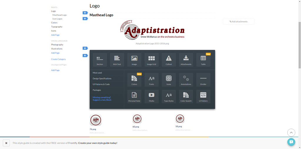
In the meantime, you can check out Frontify yourself where the good news is basic accounts for three users, 100MB of storage, and an account upgrade nag banner in the footer (as seen in the screencap above, it’s not that bad) are completely free. From what I can tell so far, the free version isn’t a watered down tool, it seems to provide the bulk of what matters most: creating dynamic style guides.