Requiring grant recipients to display the logo from the company/foundation/agency providing a grant is a common practice. It highlights the funder’s support and that public attention can help inspire additional support. The whole thing works great…until it doesn’t.
By nature, logos come in one of three basic aspect ratios (the proportion between width and height):
- Portrait (taller than it is wide
- Square (equal height and width)
- Landscape (wider than it is tall)
Whenever you need to display a group of images, it is easy to make them look equal in size and display in neatly organized grids when they are all the same aspect ratio.
The trouble is logos are never the same aspect ratio.
I’m often working with clients that must display logos from multiple funders in something like their website footer. Typically, they are displayed in one or more rows which means the common size element is height.
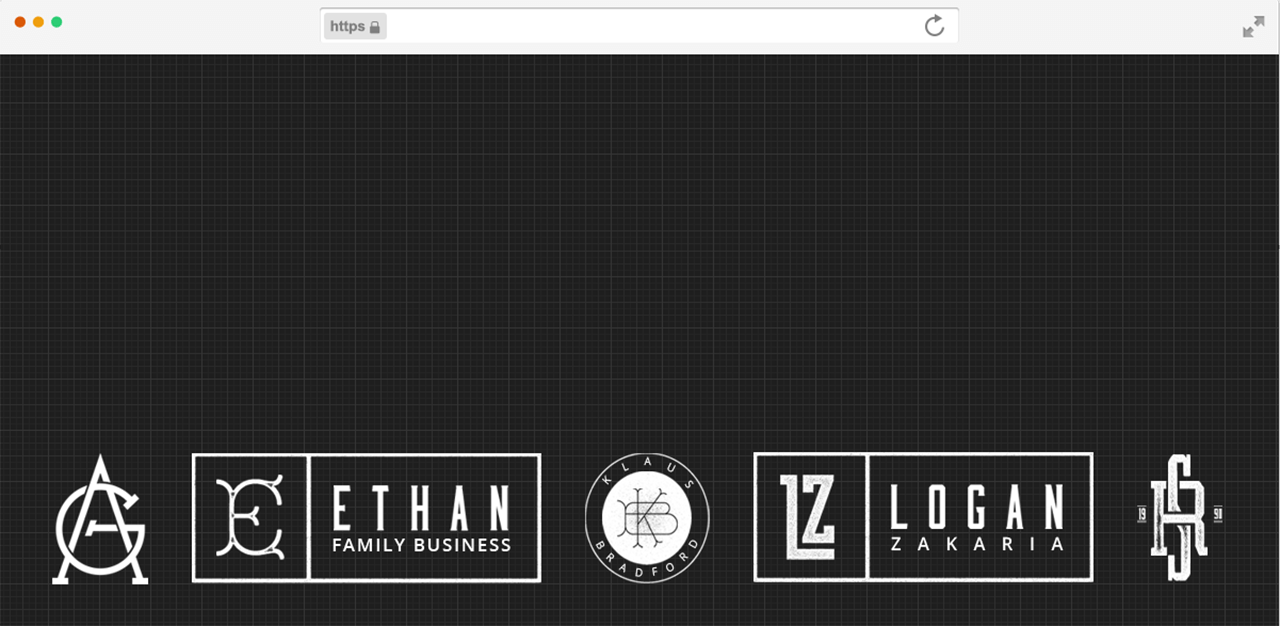
But look at what happens when you try and mix logos from all three aspect ratios together in a single row:

The landscape logos “look” bigger and more important than the others while the portrait logo on the far right appears small and less important.
While that might seem like a vanity issue funders wouldn’t fret about, that’s not the case.
I’ve seen organizations spends dozens of hours and considerable frustration making funders happy by trying to get logos with varying aspect ratios “look” equal.
The good news is this problem has a comparatively easy solution, but it requires some empathy from funders in the form of providing higher quality brand assets.
Here are three things funders can do to help:
- Make versions of their logo in no less than three aspect ratios, one of which must be landscape.
- Provide copies with transparent backgrounds, ideally having something in the original design format (like EPS, AI, PSD, SVG, or PNG with transparent backgrounds).
- Provide a copy of your branding guidelines that make it clear how the logo can be used and/or altered.
Here’s a great example of all three from Mailchimp.
If every funder provided brand assets in similar fashion, the orchestra field as a whole could save thousands of work hours per year. It doesn’t take much to calculate how much those hours cost in staff labor or outsourced designer costs and shouldn’t funders want their money being used on something else?