We’re going to geek out a bit today over a few user experience (UX) items that are going to have a substantial impact over not just online design but print design as both formats as users increasingly gravitate toward uniformity. The driving force behind many of these changes is the rise of mobile platform usage; i.e. Smartphones and tablets.
Due to the touch interfaces found on mobile devices, it should come as no surprise that user interface designs attempt to be as finger-friendly as possible. And with users spending more and more time on these devices, they are transferring those interface expectations to their traditional desktop and laptop browser experiences.
Fortunately, traditional web design is embracing these user defined expectations and moving at breakneck speed toward designs that adjust to fit whether accessed via traditional or mobile platform. The result is called Responsive Web Design; an approach that suggests that design and development should respond to the user’s behavior and environment based on screen size, platform, orientation, etc.
In order for responsive designs to work, they need to incorporate as many similar user interface elements as possible that scale from one platform to the other without loss of functionality.
In English, that means a button that might be easy to click with the fine-point tip of a mouse cursor becomes frustratingly fumblerific when used on a touchscreen mobile device.
Responsive design steps in to solve these problems by incorporating standards that scale nicely between all platforms. Two primary areas where this comes into play is font size and button widths (as an aside: a fun related conversation we’ll leave for another date is how Responsive design combined with improved optimization is going to all but eliminate the need for most performing arts groups to shell out big bucks for platform specific app designs).
Font Size
Traditionally, most folks are used to working with a standard body font size from 10px-12px and headline font size from 16px-18px. But what if I said you were going to bump those up to 16px for body font and 28px (on up) for headlines? I can almost hear the responses now.
“Good God man; I’m an adult, not a six year old! Do you want me to start using those telephone poles masquerading as kindergarten pencils as well?”
What if I told you those were exactly the font sizes you were reading right now?
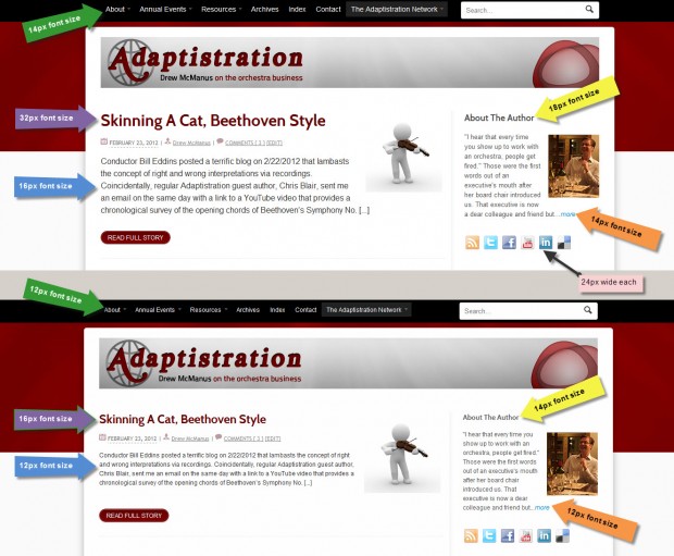
Several months ago, I started ramping up Adaptistration’s font sizes every few weeks until reaching the goal of 16px body font size and 32px (bold) headline size at the beginning of December, 2011. Hopefully, you didn’t really notice since the goal was not to dump it on you all at once.
But take a look at how much of a difference is makes going from smaller font sizes to larger, cross-platform friendly sizes. The following image compares identical homepage content from this blog in the smaller and larger font sizes. For the full impact, make sure you click the expand image icon in the top, left hand corner of the image once it pops up:

Button Widths
This area is a bit more straightforward since the goal is to design button widths that are easy enough for users to activate with a tap from the pad of their finger without worrying about inadvertently activating something else.
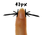
 According to some recent MIT Touch Lab studies, a likely suspect for a comfortable minimum width is 48px. To give you an idea of what that is, take a closer look at the font size image from the previous section; you’ll notice that the widths of the social media icons are labeled. They are 24px wide, a good 50 percent smaller than they should be to begin conforming to Responsive Web Design guidelines.
What that means is my conversion rates for anyone interested in connecting via social media are probably lower than they should be. Fortunately, that’s easy enough to fix and I’ll get to it over the weekend.
In the grand scheme of things, that may not seem like such a big deal but apply the same principles to your organization’s donation and ticket purchase buttons. Do they measure up to mobile UX guidelines? If not, how much ticket and contributed revenue do you think you might be losing?
UX Resources & Conclusions
It won’t take very long before many of the new UX design standards begin working their way into traditional print materials so get a head start on all of it now by learning more about emerging standards at the following resources:
- iPhone Human Interface Guidelines
- Android User Interface Guidelines
- Windows Phone UI Design and Interaction Guide – pdf file
In the end, the increase in font sizes has certainly had a positive impact on mobile browser average time per page here at Adaptistration. Since putting the final changes in place last December, the page length times have increased nearly 20 percent and since average time per page via regular browser usage only increased by seven percent in the same period, the mobile increase wasn’t likely due to content.
And when it comes to performing organization arts website, increased average time per page means increased sales and donations!
0 thoughts on “16px Font Size and 48px Wide Buttons Are The New Black”