Toward the top of any good arts marketer’s tech resource list is SmashingMagazine.com, which published a fantastic article yesterday by design consultant Cathy O’Connor about design accessibility for online content. In short, there are some astounding tools available that help you simulate what users with one or more visual impairments experience when visiting your online platforms.
O’Connor provides plenty of stats to help realize this is an aspect of design that is growing in importance but what’s genuinely fascinating is the increasing number of readily available resources to better understand why these issues matter and how you can make small adjustments to improve you visual interfaces.
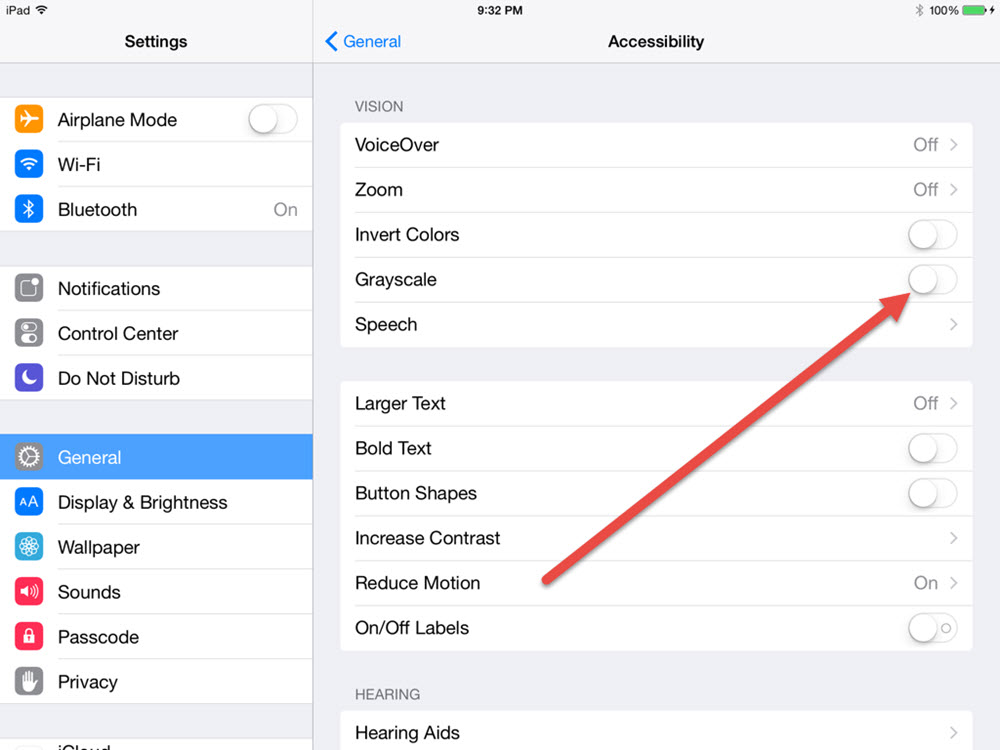
Even the recent release of iOS8 has a new feature that allows you to set the entire display to monochrome; just go to Settings > General >Accessibility and flip the Grayscale switch.
Give it a try then visit your organization’s website and social media pages; how easy is it to pick out those text links or tell if a form’s submit button is disabled because of incomplete information?
O’Connor lists three fundamental questions you should consider when reviewing your online content:
- Is anything difficult to read?
- Is the call to action easy to find and read?
- Are links distinguishable from other content?
Simple? Sure, but not so unassuming that they deserve to be overlooked. In fact, it is probably more important than you might realize. I’m willing to wager that most arts orgs out there don’t realize that most government funding agencies contain boilerplate requirements that all online content meet standards such as the Web Content Accessibility Guidelines (WCAG) 2.0. If you don’t you could lose funding.
Fortunately, there some good online tools to help you identify items you may otherwise overlook such as http://achecker.ca and here’s a tip: one of the most common items overlooked is adding an alt attribute to all images (the text name that displays in place of an image when needed).
