A few years ago, one of the last resources you would ever want to use when designing your organization’s online user experience (UX) was the airline industry; but my, how times have changed. Granted, the actual flying experience unilaterally sucks but at least the online portion has improved. Let’s take a closer look to see what happened.
A few precursors before we forge ahead; much of what we’re going to examine will have varying degrees of usefulness to most groups. For instance, if you own and operate your own box office and venue, you’ll find more of this information is applicable to your online UX development while those of you who don’t have control over those items will still be able to pull out certain threads of practicality.
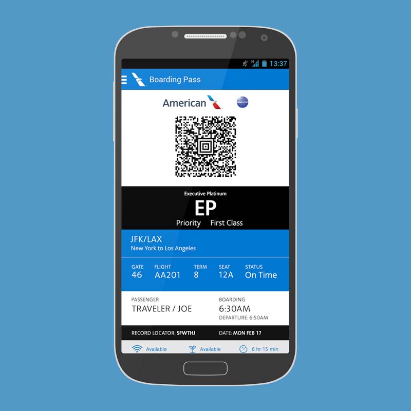
This examination also assumes that the primary reason a patron will access his/her account info via a mobile device is because s/he is attending an event within the next 12 hours. Simply put, users don’t go to an airline app to browse the latest PRs or consume vast amounts of static info; instead, they visit the site because they want to access impending flight info plus related data and/or purchase tickets.
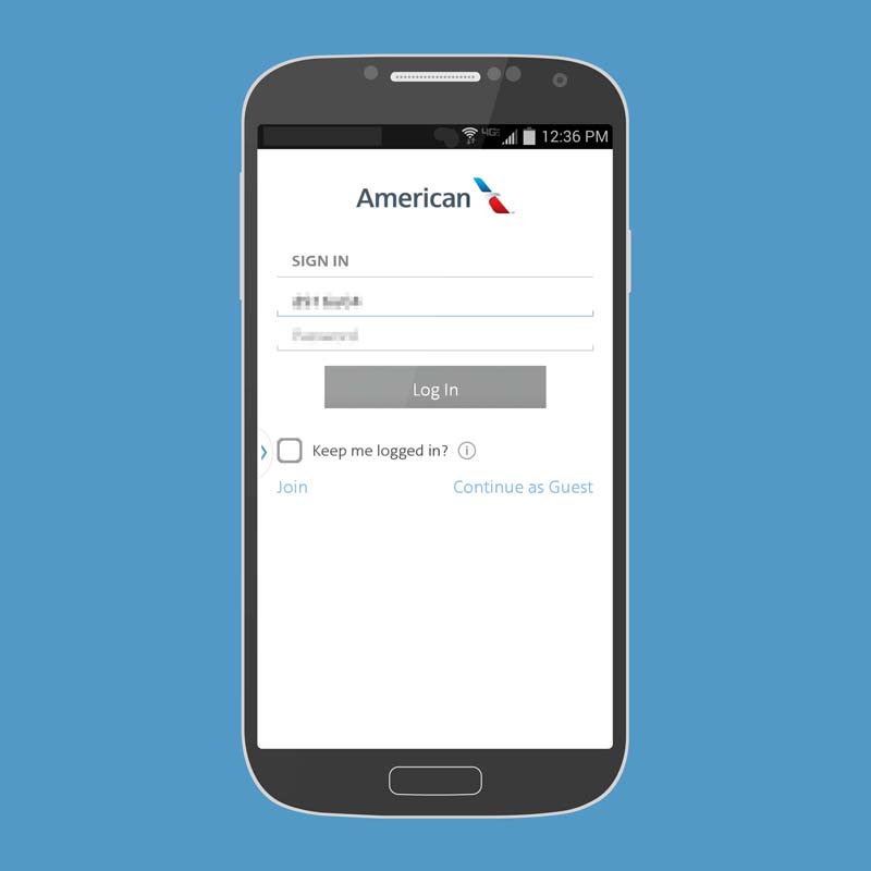
Make Required Registration And Account Creation Meaningful
A number of box office and Customer Relationship Management (CRM) systems require ticket buyers to create accounts but the ugly truth here is that requirement has far less to do with the ticket buyer’s benefit than it does with developing a database for pushing out marketing and development messages.
Ideally, account creation should be an option but if we’re going to cling to the antiquated notion that it is a must-have then let’s begin giving patrons something worthwhile in exchange; first and foremost, a meaningful UX that displays customized information based on their ticket purchases.
Less Is The New More
It’s all about streamlining the user experience. Let go of the notion that you have to fit all of the department specific flotsam and jetsam on your primary landing page after a user logs in. There are better ways to reach patrons with that information; instead, hyper focus on providing the info they’re looking for such as the patron’s most recent upcoming event.
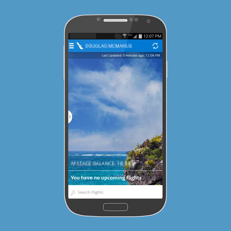
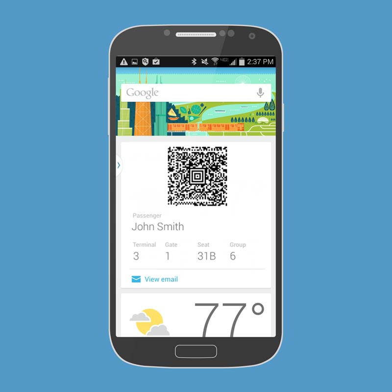
![When upcoming trips exist, they are displayed at the bottom of the screen along with tap-friendly buttons for checking in [think "Display Ticket(s)"] along with basic flight info [think "starting time" and "section-row-seat"]](https://adaptistration.com/wp-content/uploads/airline02.jpg)
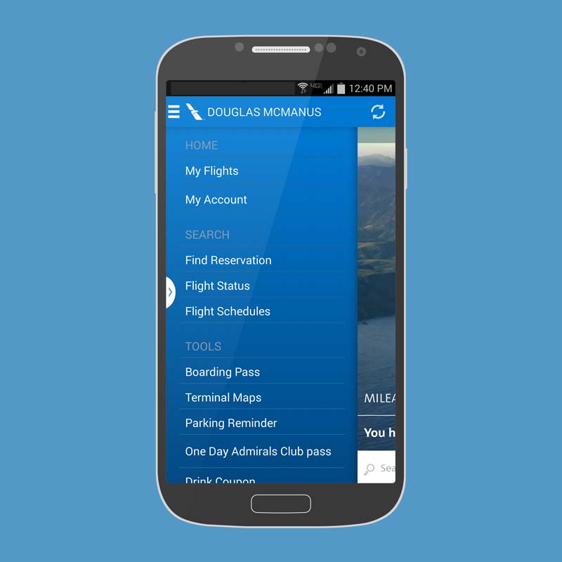
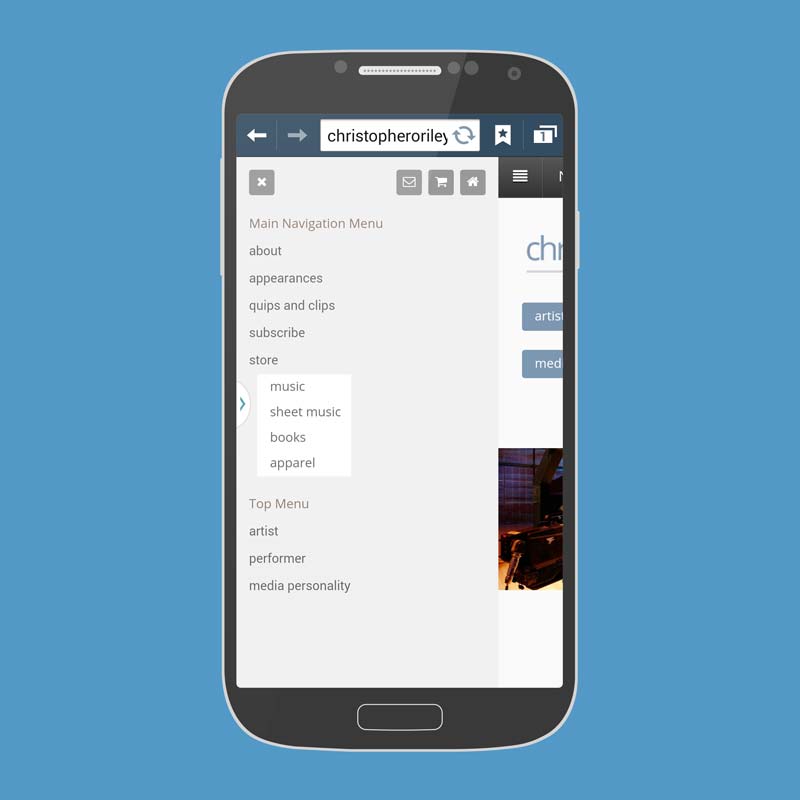
A hamburger menu slides in from the side to offer the website’s full navigation architecture, and with some simple callout styling, you can also fulfill any department specific requirement. The ease of vertical scrolling in touchscreen device menus, like the one below from American Airlines, makes it comparatively easy for users to bounce back and forth between pages with static site content.
Get In The Google Now Mindset
Google describes their Google Now personal assistant service as “bringing users the right information at just the right time” and it is pretty darn good at delivering on that promise.
In short, Google Now delivers relevant info based on items that appear in a user’s calendar, arrives via email, and/or gathered from frequently performed searches or web surfing; so if a user purchased a ticket to an event that begins at 7:30pm, Google Now is smart enough to predict that they are probably looking for directions, parking, or real time traffic and transit data about an hour before the defined start time and makes that info readily available.
You can hook a wide variety of information related to a typical event registration so as to provide additional details, such as the best entrance to use or go up the stairs to your left after an usher scans your ticket.
From a development standpoint, your box office provider can integrate Google Now so as to provide ticket buyers with reminders and push related data such as travel instructions based on the user’s location and preferences. You can even push a copy of their digital ticket via email and Google Now will display it in a prominent position on their device as the start time approaches.
For example, Google Now already provides updates to restaurant and hotel reservations or flight information received in Gmail. By marking up email notifications to your users, you can use Google Now to bring them similar updates about your events and related offerings (pre-concert social event, etc.).
Utilizing services like Google Now will help keep your organization’s relevant information in front of your ticket buyer’s eyes, all of which replaces attendance hurdles with express lanes. Moreover, adopting this approach to your UX design will help you visualize just how much the road ahead veers away from traditional performing arts organization web development.
Conclusions
With any luck, all of this is getting your creative juices flowing. It doesn’t take much to begin substituting specific items from the airline UX examples with your organization’s event specific data and that’s exactly the place you want to begin this journey. There’s no shame in copying and refining what already works but the real trick here will be steady efforts to move your ticketing and box office providers in a direction that functions as easily and cost efficiently as possible.
It is crucial to point out at this juncture that that your web designers won’t able to accomplish squat about any of this because in order for these sorts of features to work, box office and ticketing providers will need to lay down the programming groundwork with an easy to use API, or application program interface.
As an aside, you don’t need to worry about what an API is (it’s the code that lets one software application play nice with others) but do feel free to toss the initialism around with confidence, doing so will give you beaucoup street cred when talking with arts admin peeps and box office providers.
To that end, begin reaching out to your colleagues at other institutions and begin planting the seeds of change; after all, the more voices asking for this sort of functionality, the sooner it will come to pass.
