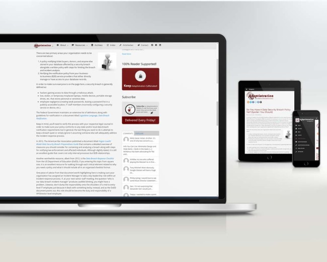
User experience (UX) is all about making websites easier and more intuitive to use; better UX means you’re more likely to visit a site and enjoy your time when you’re there. To that end, Adaptistration is offering up an early present to readers in the form of some enhanced UX based on what metrics tell us how you access the site and get around the content.
Added Love For Tablet Users
Mobile device users have been on the rise for multiple years now but the latter half of 2014 saw that trend accelerate, especially those of you using larger Smartphones and tablets. As a result, we put two big changes in place:
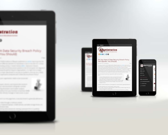
- New threshold for mobile navigation. Previously, mobile navigation (the single black strip at the top of the page with the hamburger menu icon) became visible when users accessed the site using a mobile device with a browser screen width smaller than a typical tablet (which FYI is 768 pixels wide). But even though the navigation menu looked fine in say a tablet used via landscape mode (wide), it stacked in a slightly odd way for tablet users via portrait mode (tall).
Following the enhancements, tablet users will notice the mobile menu kicks in via portrait mode, creating a remarkably focused reading experience thanks to not only the mobile menu but relocating the sidebar content to appear below the main blog content.
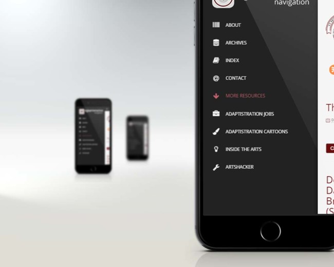
If you flip back and forth from landscape to tablet, the site will keep up with you and swap one version out for the other…like magic! Try it, it’s actually fun to flip from one to the other in seamless fashion. - New mobile navigation layout: instead of stuffing 100 percent of the menu items into the mobile version, we’ve paired them down to include only the most commonly clicked items when visiting the site via a mobile device. We also made the nav items easier to tap and added higher contrast styles.
Sticky Menus For Laptop And Desktop Users
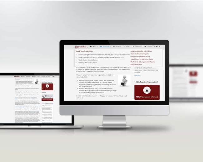
According to Adaptistration’s heatmap metrics, quite a few users make good use of just about every item in the navigation menus so in order to make it easier to get into and use them the menu is now sticky, meaning it will remain in the same spot at the top, albeit it in a new unobtrusive manifestation, as you scroll down the page.
This makes it easy to access menu at all times without having to scroll back to the top of the page to navigate to a different part of the site. The really cool bit is it only kicks in when you access the site using a laptop or desktop. In order to help bring out the new feature, we turned up the transition animation just a bit so it really makes it easy to notice it sticking to the top of the page.
Speaking of heatmap metrics, check out this great ArtsHacker post on the subject from Ceci Dadisman).
All of the above solutions are part of special functionality designed as part of The Venture Platform that a number of our users have put to good use (especially these folks) and it has been ported over here to improve your experience; to that end, I hope that’s exactly what it does!
UPDATE: completely forgot to mention that the UX improvements here have been applied to Adaptistration Jobs too so swing by there and experience the changes.


