The 2008 reviews witnessed a number of intriguing trends, including a surge in larger budget orchestra scores which allowed them to dominate this year’s Top 10. With a few notable exceptions, this trend continued throughout the rest of the review resulting in 2008 being the first year where the overall rankings favored larger budget organizations…
Of course, that doesn’t mean smaller and middle size budget groups did poorly, in fact many orchestras in the 11-20 range belong to those groups. Nevertheless, no organization is at a disadvantage when it comes to designing an effective website so long as they focus on the core elements detailed in the review criteria.
Starting right off with good news, the average orchestra website improved since 2007. Not only did the average score improve but that score increased more than any previous year. On the other side of that coin, the average score still only managed to secure a grade of “D” which is two letter grades lower than any orchestra should be satisfied with.
Grades
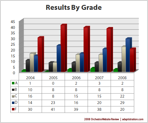
For 2008, overall grades showed signs of improvement. Perhaps best of all, the number of orchestras receiving a failing grade decreased by nearly half. As a result, orchestras receiving a grade of “C” or “D” increased 46 percent and 45 percent respectively. On the higher end of the scale, orchestras receiving a grade of “B” remained exactly the same while those which received an “A” decreased by one.
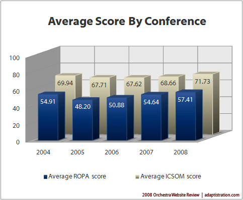
When examining the average scores by conference, this year’s review produced the first average score to exceed a grade of “D.” ICSOM orchestra managed to improve by almost 4.5 percent with an average score of 71.73 while their ROPA peers improved even more (five percent) although that continued to leave them with an average score of 57.41, garnering a failing grade.
Impact of Revised Evaluation Criteria on Category Scores
The revised evaluation criteria had a significant impact on how each orchestra scored in the 2008 review; for example, 2008 witnessed the largest number of ties; 18 orchestras tied for 9 slots, two of which were in the Top 20.
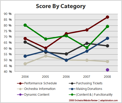
On a positive note, the one category which witnessed the largest single increase in average score, Performance Schedule, was also a category which was not modified from previous reviews. This increase was due in large part to a high number of orchestras incorporating an interactive concert calendar on the front page along with clearly defining upcoming concert events.
Another unaltered category to show marked improvement from previous reviews was Making Donations. To a large degree, most of the improvements in this category were due to the number of middle and smaller budget organizations finally taking advantage of third party donation services, most of which have been available since the first review in 2004. The final unaltered category, Purchasing Tickets, unfortunately garnered a slightly lower score over last year due mostly to a decrease in the number of orchestras offering online subscription purchases.
The remaining three categories were highly modified from last year’s review and deserve to be examined with a quantitative eye. For instance, the Functionality category had several subcategories moved to the Dynamic Content or Orchestra Information categories. The remaining sub-categories were those which traditionally received higher scores in previous reviews. As such, although the category score increased considerably from when it was defined as the “Content and Functionality” category, the remaining sub-categories received comparable scores.
In a related instance, even though the Orchestra Information category scored slightly lower than previous reviews, most of the unchanged sub-categories actually scored slightly higher than previous years. However, the overall category score decreased due to the addition of new sub-categories which garnered low average scores.
Finally, the new Dynamic Content category generated mixed results. On one hand, some orchestras earned excellent scores with regard to new efforts utilizing new media tools but overall, most orchestras scored very low. In fact, compared to the other categories, Dynamic Content generated the lowest average scores. With regard to sub-categories which migrated over from previous reviews, although more orchestras posted media contact information, not so many provided traditional media resources.
Detailed Scores
In order to view any orchestra’s detailed category scores, just click on their respective chart below to enlarge (TIP: the orchestra’s name will pop up when you drift your mouse over the chart). Orchestras are listed alphabetically and you can browse through each chart in the gallery directly from the viewer after opening your first chart.


