On 7/23/2013, Adaptistration published an article about “Authentic Design,” which examined the growing design shift away from skeuomorphic and stylistic excesses (such as using realistic page turn effects for digital pages) in favor of what is colloquially known as flat design. Since then, I’ve been looking for a way to incorporate flat design into Adaptistration then measure the resulting impact and I’m pleased to say that the recent round of efforts have been producing positive results.
The changes were put into place over the course of several days from 8/12/13 through 8/23/13 and released is four segments:
- Updating social media icons to flat design variations and relocating from sidebar to header.
- Replacing the footer widget promotional images.
- Replacing the sidebar widgets images promoting the donation and weekly email summary subscription as well as the images used for the “As seen in…” section.
- Updating the main navigation menu styling (via desktop/laptop browser widths) from a gradient to flat background color
Within a period of a few days, the changes were already producing positive results. Granted, changes to the images and related content for all three of these items have been modified to various degrees over the past two years, but those changes did not manage to produce positive results as quickly as the move to flat design.
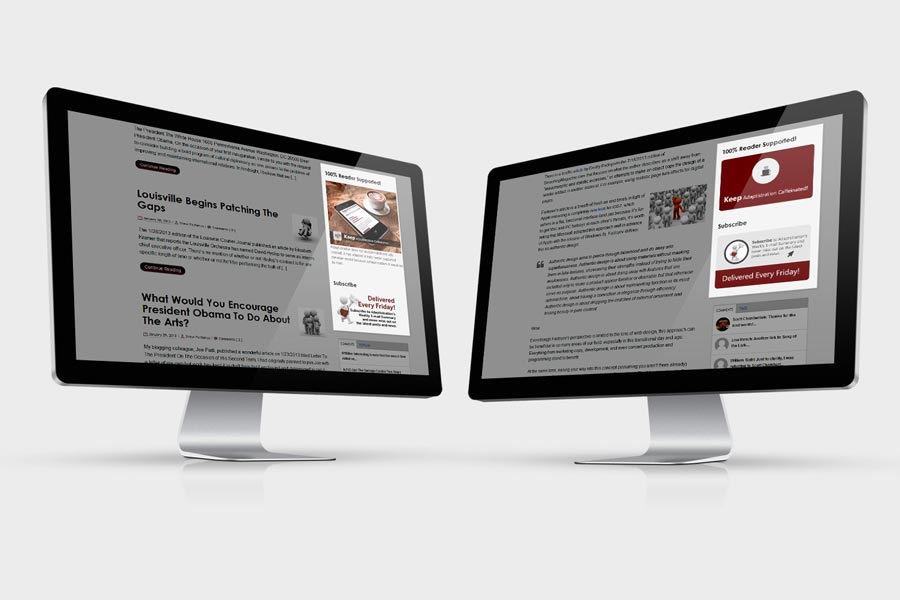
Clearly, the changes are having a positive impact on user experience; indeed, metrics confirm improvements in conversion and/or usage for all flat design items, the two biggest changes were related to a sharp uptick in email subscriptions and coffee tip donations, both of which were located in the sidebar.
Some common elements in each of the image related flat design updates includes using less text, larger blocks of solid colors, and favoring simple icons over photo-realistic imagery.

If nothing else, the results demonstrate the value in making regular small and incremental changes in lieu of sweeping site-wide comprehensive design updates once every few years (a topic we explored in a trio of articles from 2012). Granted, this approach is most effective if the underlying site framework, navigation architecture, and layout is solid and doesn’t hamper user experience; without that firm foundation to build upon, you may not experience comparable results when undertaking similar efforts.
Anyone else out there incorporating flat design via incremental changes?
Anyone else out there incorporating flat design via incremental changes? If so, take a moment to send in a comment to related your experience.

2 thoughts on “Get Pumped Up Over Flat Design”