Recently, SmashingMagazine.com held a “Redesign the Web” poster contest with the aim of making the Web a more accessible and usable place. They received a number of great entries but three contributions really stood out that, when grouped together, sum up just about everything that is wrong with most arts organization web designs as well as pointing out the direction they should follow.
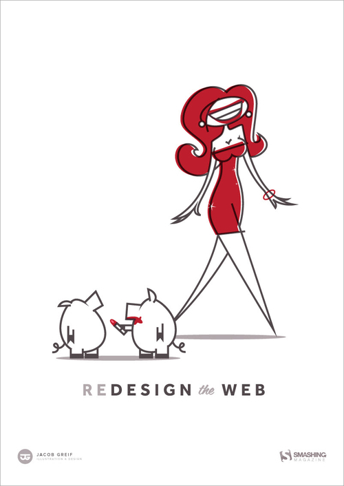
How most arts organization web design works…
Poster design by Jacob Grief (don’t get the reference?
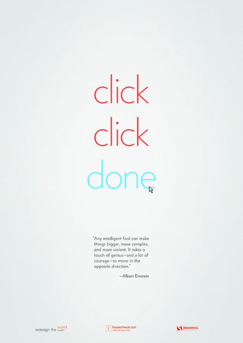
The web design process arts organizations should adopt…
Poster design by Kevin Riedy.
Followed by stupid-proof guidelines for creating the ideal user experience…
Poster design by Jin Wook.
In summary, when it comes to arts org web design, less is the new more. It’s just that simple.
About Drew McManus "I hear that every time you show up to work with an orchestra, people get fired." Those were the first words out of an executive's mouth after her board chair introduced us. That executive is now a dear colleague and friend but the day that consulting contract began with her orchestra, she was convinced I was a hatchet-man brought in by the board to clean house.consulting and technology provider work for arts organizations involves due diligence, separating fact from fiction, interpreting spin, as well as performance review and oversight. So yes, sometimes that work results in one or two individuals "aggressively embracing career change" but far more often than not, it reinforces and clarifies exactly what works and why.blog about the orchestra business, provide a platform for arts insiders to speak their mind, keep track of what people in this business get paid, help write a satirical cartoon about orchestra life, hack the arts, and love a good coffee drink.
View all posts by Drew McManus | Website


