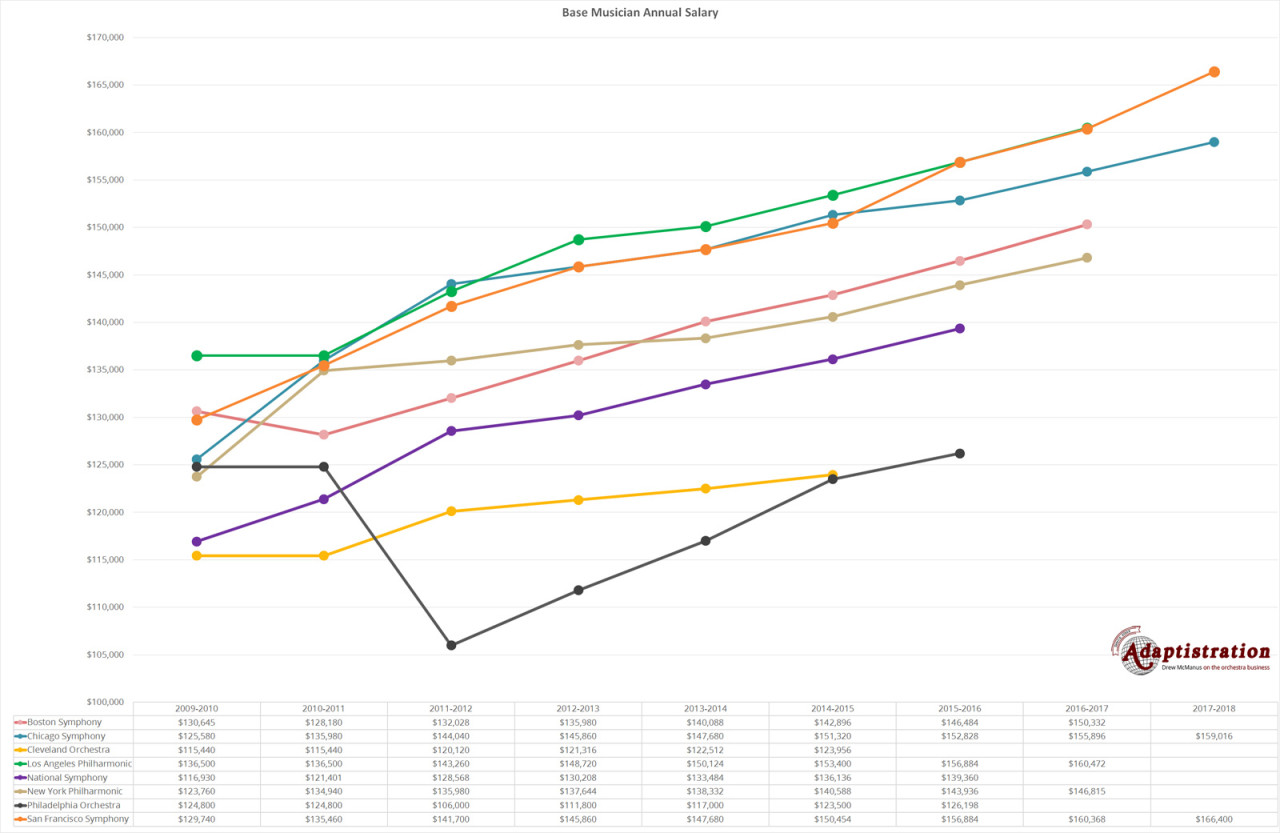
Now that Cleveland has settled, we can begin to get a sense for how base musician compensation compares across the highest tier of big budget orchestras, which we’ll call The Big Eight (Boston, Chicago, Cleveland, LA, National, New York, Philly, and San Francisco). Granted, we’ll be updating this chart with Cleveland’s figures once that data is available and when it is, it will be interesting to see how they compare with Philly, their nearest compensation neighbor. But for now, this should give you a sense for how these groups compare.
Caveats. Why Did There Have To Be Caveats.
Keep in mind, these figures cover base musician compensation and not every group reports that figure in the same way. For example, some groups incorporate items such as electronic music guarantee (EMG) payments in base compensation while others list it separately (which can influence things such as how much substitute musicians are paid). For the chart below, EMG has been included in order to provide as reasonable a comparison as possible.
It is also important to note that due to changes in pension plans, out of pocket health care contributions, seniority pay, and more, base musician figures aren’t as reliable of a figure as they once were when it comes to determining competitiveness.
But wait, there’s more.
You can even find disparities between musicians in the same ensemble, such as National Symphony where musicians adopted a disparity in seniority pay thanks to different formulas for musicians hired before and after September 4, 2012. In short, musicians prior to that date earn a high seniority rate than those hired after. So in this instance, musicians within the same ensemble earn different minimum compensation rates and this is an excellent example of the sort of thing you won’t be able to determine if you only look at the base compensation figures.
Lastly, thanks to so many recent agreements coming in after the previous agreement expired, there will be a bit of variation based on whether the terms from the new agreement were retroactive. For instance, if you play in Cleveland, your recent agreement did; if you play in Philly, it didn’t. That doesn’t amount to a tremendous amount of money but can account for slight discrepancies.
Note: since this is such a big chart, we needed to use a full page layout for today’s article but even then, you may need to click for the full size image or even download the chart then view on your device in order to absorb the detail.

It’s interesting to see how these ensembles started to form three distinct groupings toward the middle of the timeline with Chicago, LA, and San Francisco at the top; Boston, New York, and National in the middle; then Cleveland and Philly on the bottom. But as we move forward in time, they are beginning to spread out.
Do you have any questions about the data or how base musician compensation works? If so, feel free to send in a comment.