Joe Patti keeps sucking me in with his headlines and yesterday’s post was no exception: Probably The Only Time Comic Sans Is Appropriate In A Planning Document.
If I’m being honest, I didn’t even read the rest of the article because it made me wonder what actual orchestra mission statements look like in some of the worst fonts of all time.
And that’s all I needed to go down that rabbit hole. So without further ado…
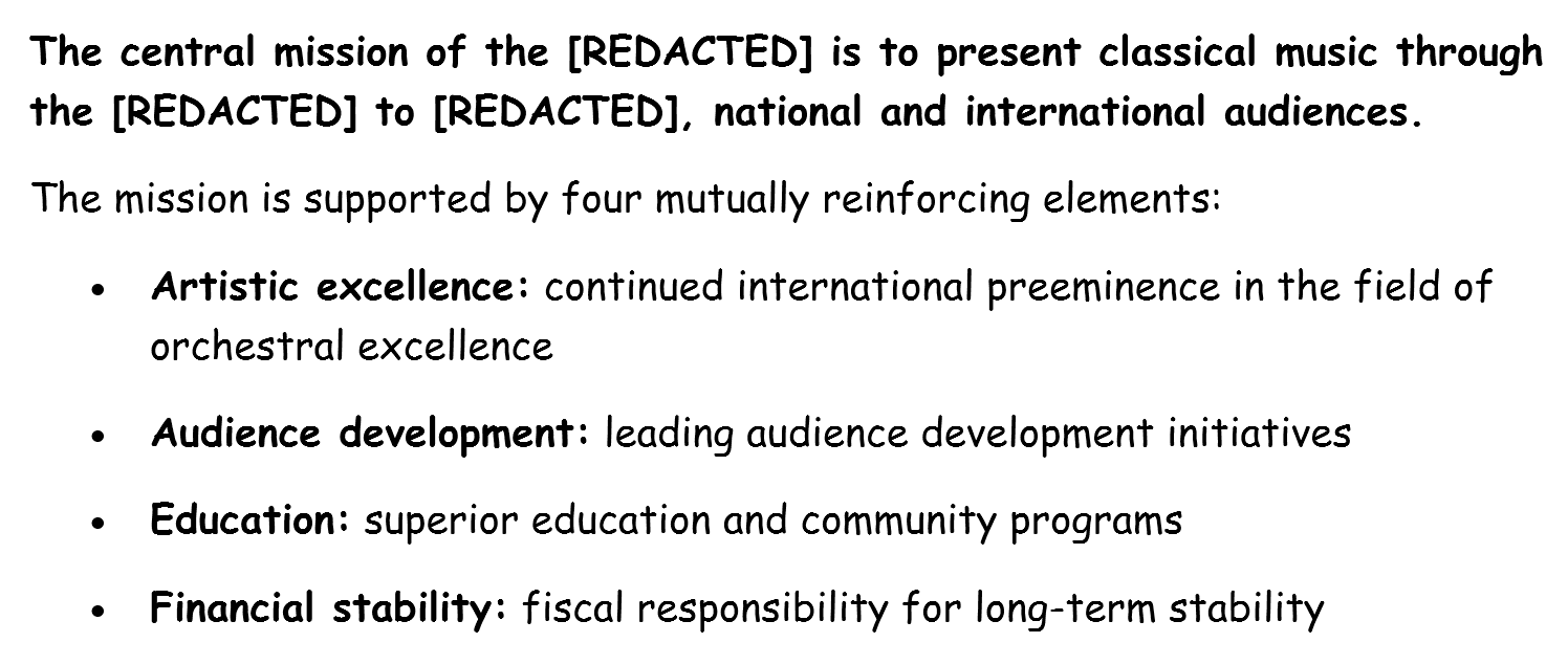
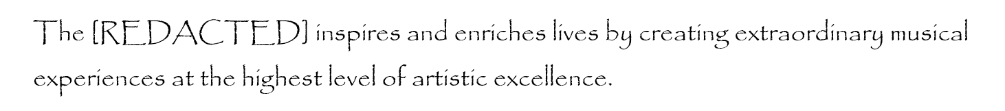
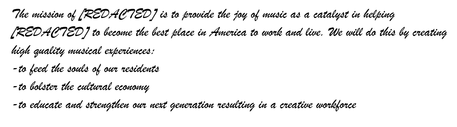
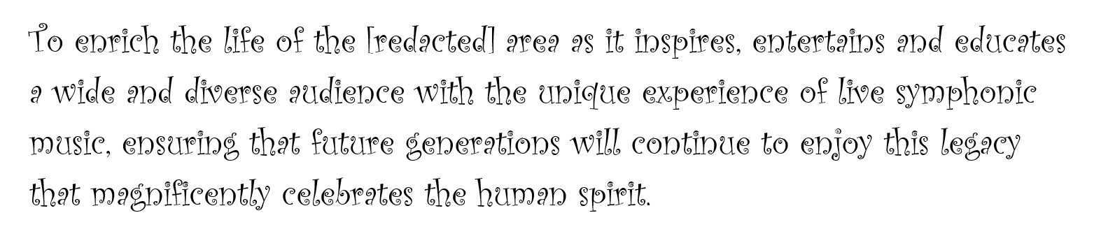
Comic Sans: tried and true, hated by so many, loved by so few.Papyrus. We’re looking at you James Cameron (he knows what he did).Brush Script. Starting to feel queasy yet?*urp* CurlzTrajan. So stoic. It almost fits. I guess the joke’s on me?It wouldn’t be a font hater party without serving up…Lobster.
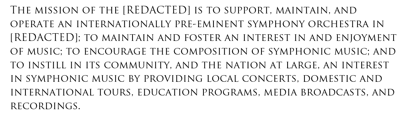
And since there’s a good reason the adage what’s sauce for the goose is sauce for the gander exists, here’s Adaptistration mission statement in a font guaranteed to offend the full range of sensibilities.
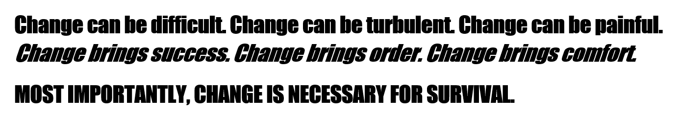
When exclamation points fail to convey the humanity, there’s Impact.