ArtsHacker
Not All Mobile Users Are Right-Handed
Wed, Jun 6, 2022
by Drew McManus
For whatever reason, I still see a lot of web design on mobile devices fall into the trap of using buttons that align primarily with the left or right side of the screen. For a low to mid priority call to action, that may be okay but for your highest priority items, like Buy Tickets,
Stop Using Carousels And Sliders For Content Delivery
Mon, Apr 4, 2022
by Drew McManus

For the past decade, I’ve been helping clients through the reasons why they should avoid using website carousels and sliders for content delivery. The most common place this counterproductive practice appears is on a homepage where organizations attempt to stuff concerts, fundraising messages, and more into a carousel thinking they’ll all have comparatively similar conversion
Applying A Mix Of Empathy And UX To Offer New Ticket Buyers What They Want
Mon, Mar 3, 2022
by Drew McManus
One of the more intriguing parts of designing the reserved seating process for UpStage was the user testing. It’s rare for nonprofit performing arts organizations to spend much time designing their online ticket experience around the new ticket buyer and that only leaves money on the table and untapped potential. When designing UpStage’s process, we
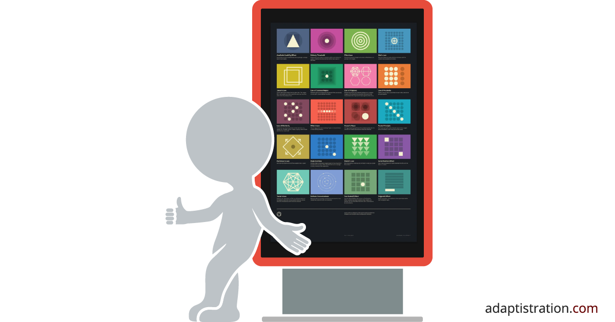
Applying Parkinson’s Law To Create More Efficient Processes
Mon, Feb 2, 2022
by Drew McManus
The latest installment in the series of articles I’m writing about how arts administrators can use the Laws of User Experience to be better at just about everything they do is now published! This article focuses on Parkinson’s Law, which dictates any task will inflate until all the available time is spent. It’s common to apply this
Use A Person’s Natural Tendency for Grouping Content To Your Advantage
Tue, Feb 2, 2022
by Drew McManus
The second installment in the series of articles I’m writing about how arts administrators can use the Laws of User Experience to be better at just about everything they do is now published! This article focuses on the Law Of Common Region and how you can help boost a person’s natural tendency to group similar
