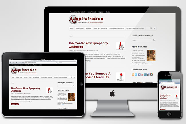
If you’re a regular visitor, you’ve likely already figured out that things look a little different and those changes are the result of a major theme upgrade over the weekend that launches Adaptistration into the programming equivalent of the space age thanks to a new fully responsive design functionality.
The upgrade started out on a separate server and the plan was to roll it out there and conduct nit-picky levels of bug checking before uploading to the live site but initial tests indicated that although bugs are present, they’re minor. Consequently, the enhancements are cool enough to justify a bit of Damn the torpedoes full speed ahead! attitude and launch the new theme today!
What’s The Big Deal With Responsive Design?
In geekspeak, responsive web design is an approach which suggests that design and development should respond to the user’s behavior and environment based on screen size, platform, orientation, etc.
In practical application, it means you only need one version of a website with one admin panel and it will work across all platforms. No need for apps, mutually exclusive mobile optimized themes, etc. Pretty slick, eh?

We’ve covered the topic in much greater detail in recent articles (here, here, here, and here) but all in all, the upgrade was comparatively painless for as many changes it ushered in and that’s always a good thing. As mentioned, it’s operating at about 90% so expect things to get even better over the course of the week.
Updates
- New minimalist graphic design to better suit responsive capability.
- Updated placeholder, logo, and masthead graphics.
- Redesigned navigation structure: top navigation bar contains network and account links while main navigation bar contains content related links.
- Improvements to navigation funnels vis-a-vis Google Analytics data; in particular, new funnels for Web & Tech items as well as Compensation & Finance items.
- Subtle changes in typography and increased use of white space.
- Rounded avatars.
- Increased focus on typography and less on images for design elements.
- Related content that was once distributed across multiple pages is now available on a single page via tabbed and toggle display features. This means less clicking and faster browsing!
New Features
- Fully responsive design will scale site to fit on all browser widths/resolutions and on all mobile devices.
- Twitter and Facebook share links right from image lightboxes. This is an especially useful enhancement in that many images are the inspiration for social sharing, such as the Is Philadelphia Competitive? editorial cartoon. Now you can share a direct link to the actual image!
- Breadcrumbs. No more getting lost in the digital woods thanks to the omnipresent breadcrumb trail located below the main navigation and primary body content.
- “Related Posts” list at the end of each article.
Known Bugs
Not all of the tabbed functionality is working such as the sidebar tab widget to flip between comments and popular posts.Fixed!The top navigation bar dropdown isn’t working on some mobile devices (older versions of iOS and Android operating systems).Fixed!Not all forms are working; for example, the weekly email subscription and Branding Style Guide form are fine and dandy but the general contact form isn’t.Fixed!Lightbox functionality not working on all images.Fixed!- A bit of wonkiness on image thumbnail sizing.
Looking at your iMac on my iMac screen – neat! What will the Apple WWDC bring us today?
Congrats, Drew! The site looks terrific. I especially appreciated reading: “Increased focus on typography and less on images for design elements.” I have been thinking lately that emphasis on text is on the cutting edge of the internet, today. Your move confirms it! Thanks!
Thanks George! Personally I’ve always loved typography but it has been an issue for websites and browser displays for God knows how many years. Fortunately, that’s all changing and with new ease of implementation comes renewed interest.