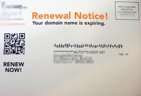
It’s always fun when unrelated items converge in just the right way at just the right time to uncover something useful. Case in point, I received four single show sales mailings from performing arts organizations (one orchestra, one opera, and two performing arts centers) and a domain name renewal notice and when all five pieces were strewn across the desk, it was tough to miss how the renewal notice was vastly superior in conversion-oriented design.

The domain name renewal was a single 3×5 card with a well placed QR Code on the address face that directed users to a login screen that, once user credentials were verified, redirected right to the corresponding renewal purchase page promoted in the mailing. This company already has my credit card info on file and that was presented with my personal info alongside clearly marked minimal renewal options selected and “recommended” upsells ready to be added to the shopping cart. All I had to do was click the requisite “I have read and agree…” box then click the “purchase” button and I was all done.
The performing arts org brochures, on the other hand, had no QR codes, the box office phone numbers were tiny and hard to find, and one didn’t even have their URL listed! Now, I’m familiar enough with each one of the four performing arts orgs to know that three have direct control over their box office; each of which sports a very pricey, well known box office software platform while the fourth group is stuck, beyond their control, with Ticketmaster.
So for three out of four of the groups, that means they have the capability to put something in place like the system being used by the domain registrar. Instead, if users wanted to buy a ticket online, they would have to go to the organization’s website, login, find the show, and slog through the shopping cart process. Compare that to the less than one minute process offered by the domain registrar that encouraged users to take care of business right from a smartphone or tablet!
Which one would you bet has a higher conversion rate?
The message here should be self evident but in order for performing arts groups to begin getting everything they can out of QR Code tools in promotional mailings, here are a few technical tips to keep in mind during the design stage:
- Don’t burry the QR Code, place it in the designated primary action area of the mailing.
- Make sure the QR Code is anywhere from 75px – 100px square, or 1″ – 1.33″ square.
- Please, please, please make sure the destination page is fully functional on all smartphone and tablet operating systems. Don’t go sending them to a shopping cart that relies on [sws_css_tooltip position=”left” colorscheme=”rosewood” width=”450″ url=”javascript:void(0);” trigger=”Flash” fontSize=”14″]Don’t forget that Flash driven components don’t work on iPhones and iPads. [/sws_css_tooltip] or some other counterproductive irritation that doesn’t play nice with mobile platforms. In fact, you’re better off sending users to a404 error page; it will ultimately be less frustrating.
- Test the QR code in print format on no less than an iPhone and Android powered device before sending it off to a printer.
- If the mailing has no interior pages, it isn’t a bad idea to place the QR Code on each side, just in case one side gets folded, spindled, or mutilated during delivery.
- Include a very short notice indicating what the QR code will do; such as “scan here to buy tickets from your account.” Likewise, if the mailing is larger than something like a 3×5 card, consider including a link to a recommended QR reader app.
- If you’re only planning on setting up the QR Code to direct ticket buyers to your homepage, don’t bother (just make sure your URL is clearly marked on the mailing).
Very cool! Really, the biggest problem I’ve seen with QR codes, is one of the ones you identified: the website it takes you to is not optimized for mobile or tablet. Once the coolness of using a code in the first place wears off, the user has spent a wasteful amount of time trying to figure out what to do and where to go on the tiny-sized website, and it would have been better to do it on the computer.
Seems like thoughtlessness or the inability to think through to the end of the process is the vice of the day.
Great post, Thanks!
Thanks Rachel, and you touched on one of my pet-peeves in the form of standard websites that still use a 12px standard content font size. It’s eye-bleeding small on standard browsers and exponentially worse on smartphone and tablets. The ideal font size I recommend for Venture users and all of my tech clients is anywhere from 14px-16px, depending on the actual font family being used. I know, for some folks that seems shockingly large but there are a slew of good reasons for using it, not the least of which are substantially improved display value on mobile platforms.