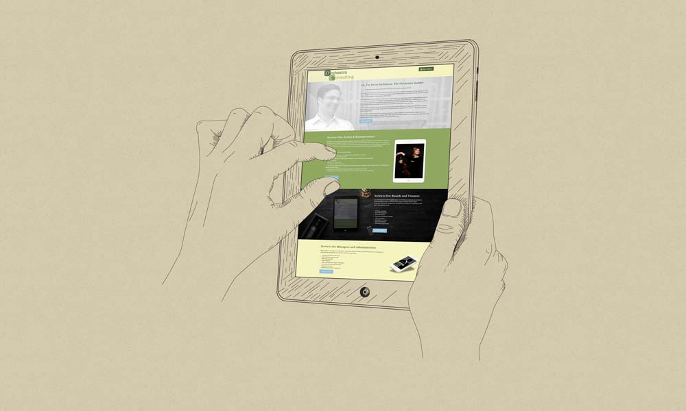
It may only be Wednesday but it has been a busy week for new and updated web work. Regular readers already know that ArtsHacker launched on Monday (and has been doing gangbuster traffic!) but there was a good bit of overtime for big updates at both InsidetheArts.com and OrcehstraConsulting.com.
InsideTheArts.com features a new grid style layout for the homepage, a new header graphic, a new logo, and an ultra zen nav toggle that completely replaces the traditional navigation bar. The latter bit of functionality is pretty fun and is one of the latest design trends indicating that mobile usage is having far more influence on desktop user experience than the other way around. There are also new logos for about half of the bloggers; the one for Brian Dickie is particularly fun.
OrchestraConsulting.com was way overdue for an update and the latest design approach is decidedly along the lines of less is the new more. Instead of stuffing service descriptions inside interior pages, everything is laid out on as fluid homepage that uses high contrast full width rows to encapsulate the content. The updated version features a new logo, updated typography, the same nav toggle system described above, a new testimonial module, a good bit of content updates to reflect the shift in my consulting work (not the least of which is an updated client list), and loads of clean flat design.
I’m also in the process of migrating the growing library of media content from stuffing everything into a single page to using a Tumblr style post format for video and audio content. It will make it easier for users to scroll through the content as well as encourage more frequent updating. Overall, there are a few wrinkles to iron out via some of the tablet and Smartphone layouts but it is in perfectly fine shape until those loose ends get wrapped up by the end of the week.

